UX & UI, Digital Design
Ivee
Intro
Redefining the passenger experience
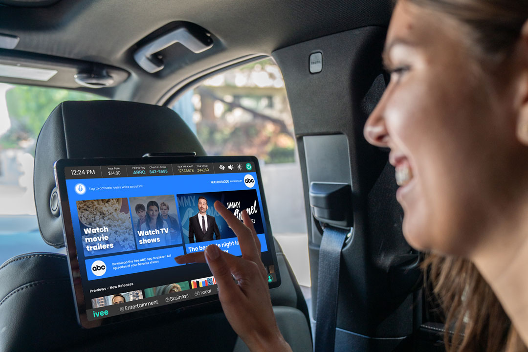
As the ride-hail industry continues to grow, passengers are bombarded by even more advertising. Ivee strives to be a valuable infotainment system to the passenger and not just another easily ignored screen full of ads in their ride.
I led end-to-end UX and UI design from the ground up, utilizing journey mapping, service mapping, personas, user flows, wireframing, and rapid prototyping, to design a scalable design system and MVP.
Stakeholders
Head of Marketing
Head of Product
Tools
Photoshop
Illustrator
After Effects
Figma
Timeline
Ongoing
Challenge
Do it all in 30 days.
Goal
Create a design system to maintain consistency across touchpoints (website, product/ software, and mobile app)
Standardize branding, visual elements, and functionality of standard features like Ivee’s Tiles, Apps, and Offers
Design UX and UI for Home and Ride Mode screens
Stakeholder Interviews
Understanding the scope
Valuable Q&A from stakeholders about goals and future product vision.
Why We Exist:
Ivee helps people make the most of their time on-the-go.
What We Do:
Ivee personalizes the passenger experience.
How Do We Do It:
Ivee is a personalized passenger infotainment system that will make a ride as relaxing as a spa, as productive as your office, or as entertaining as a home theater.
Competitive Analysis
Understanding the space
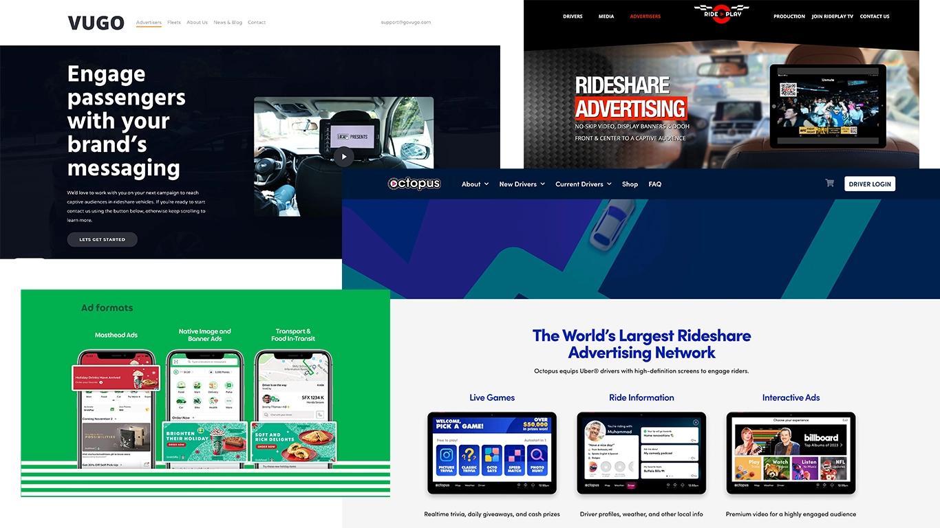
I took a look at competitors to make sure we created a system that stood out while also felt familiar. Trips range from 10 minutes to 1 hour, so it’s better if time isn’t spent on a learning curve.
Results
Implementing a design system
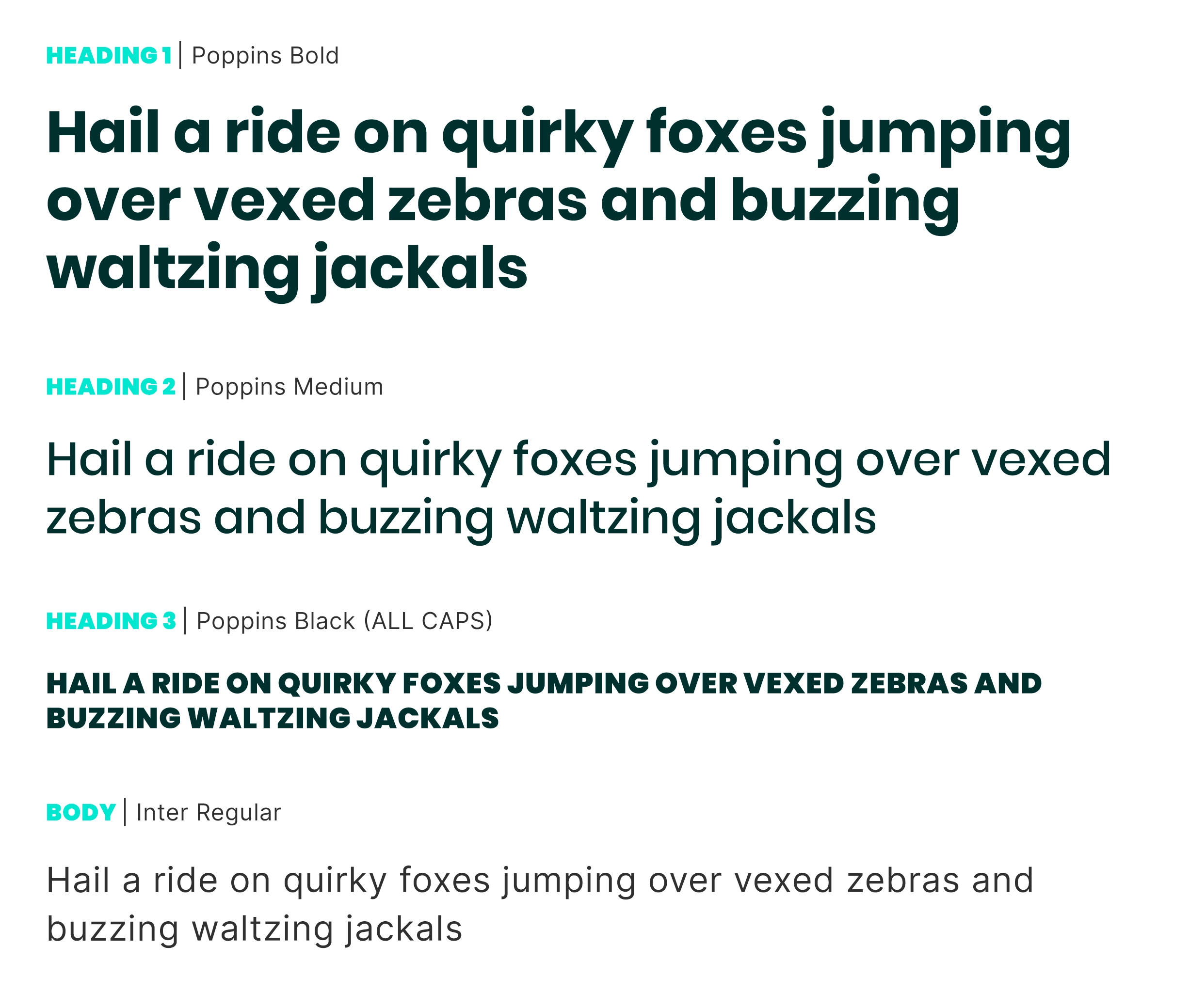
I created a scalable design system from the ground up to set brand standards across all touch points including in-vehicle tablet, website, mobile app, and in-person trade shows to maximize efficiency on cross-functional teams.

From the competitive analysis, it became clear that the old logo’s color palette felt overly clinical—more aligned with healthcare branding than with a product like Ivee.

Choosing a brighter, more contemporary color helped establish a fun, tech-savvy tone for the brand, while also offering significantly better contrast against a dark UI.

Home Screen
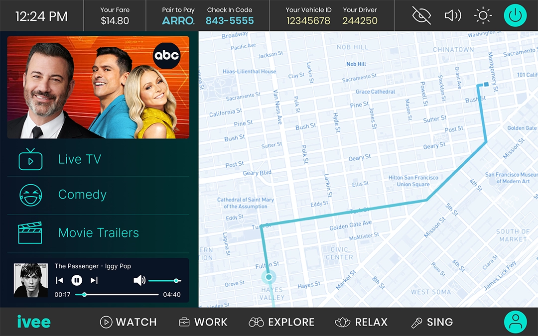
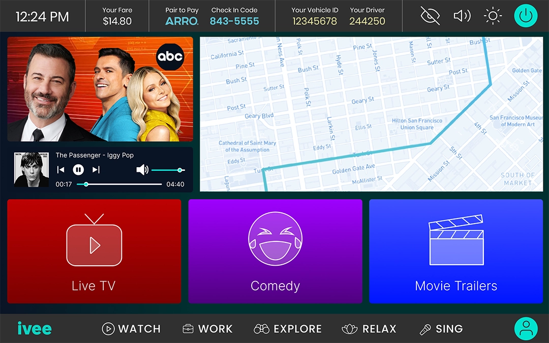
The Home Screen serves as the passenger’s first touchpoint after entering the vehicle. It provides a clear overview of their trip while introducing key in-ride features—such as selecting music, viewing local news or movie trailers, and exploring various ride modes. To determine the most intuitive and engaging layout, we conducted A/B testing on two design variations, evaluating clarity, feature discovery, and overall passenger interaction.
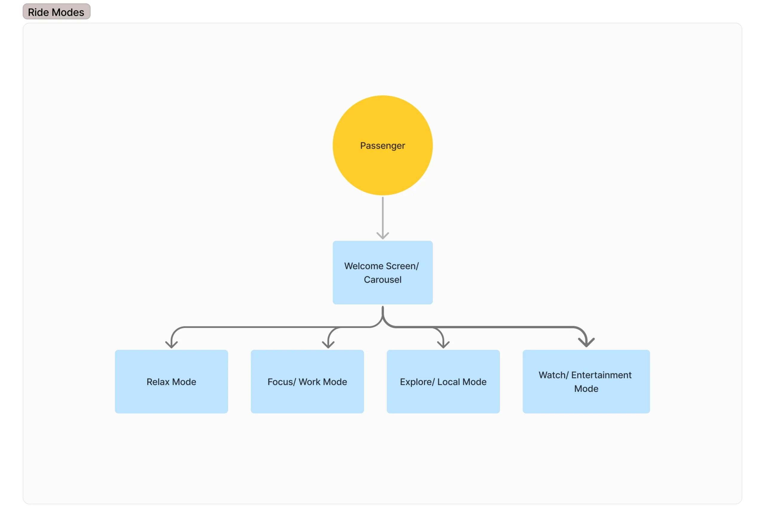
Ride Modes
Studying personas, we defined four “ride modes” for the most common types of passengers and rides like morning commuters, leisure and business travelers, and night crowd.
